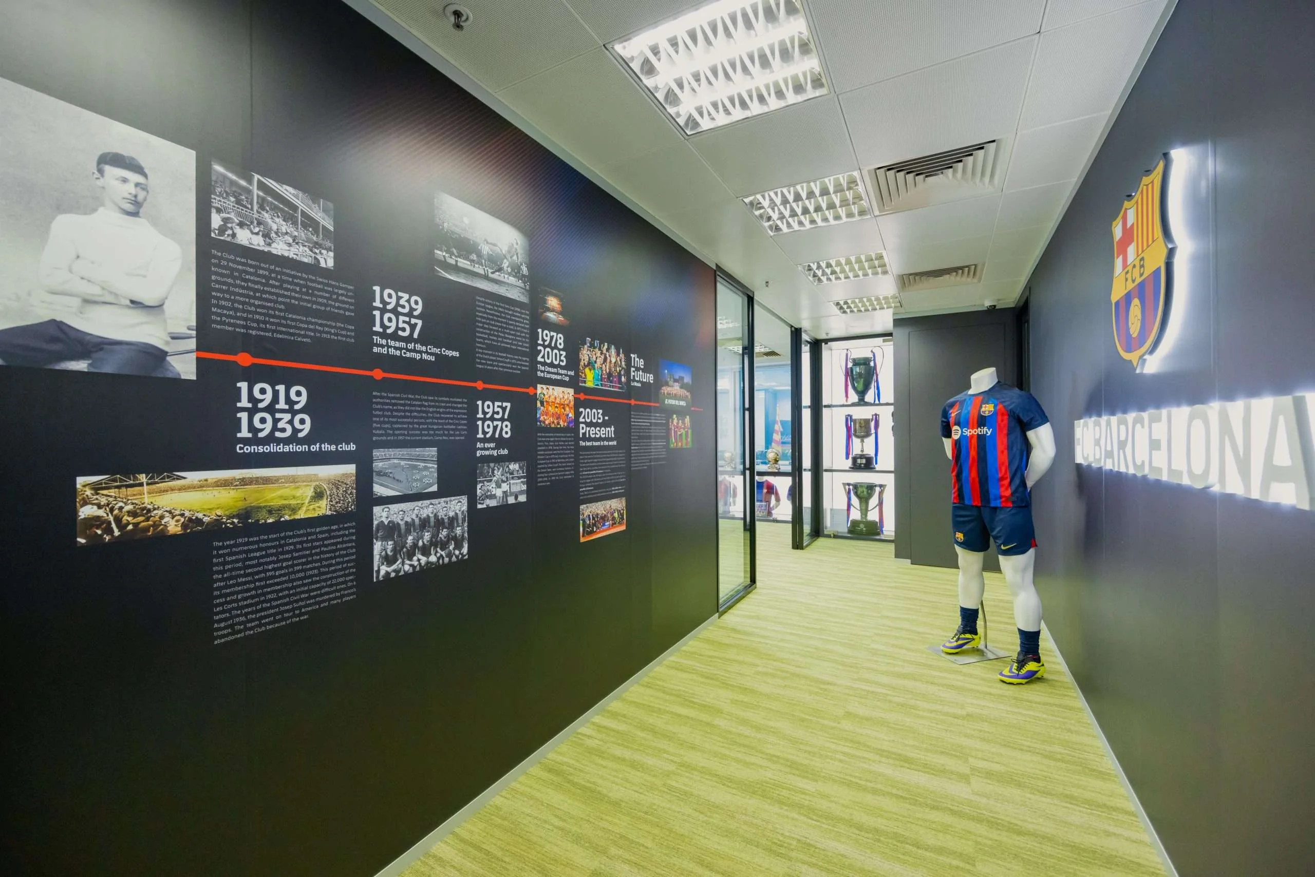
The most useful office interior design ideas are not decorative themes. They are decisions about how a workplace should help people focus, collaborate, host and adapt.
In This Guide
- 01Begin with a clear point of view
- 02Create an arrival that does more than greet
- 03Give people a choice of work settings
- 04Use light and colour to support orientation
- 05Bring nature in through performance, not props
- 06Make technology feel part of the room
- 07Choose details that can age well
- 08Edit the idea until it is buildable
01
Begin with a clear point of view
Before collecting references, agree what the office should feel like and why. A client-facing financial business may need composed hospitality and discreet meeting settings. A growing creative team may need visible project space and adaptable collaboration. A regional headquarters may need a consistent brand experience that still works for local operations.
A useful design direction can be expressed in a few practical words: calm and precise, warm and hospitable, flexible and energetic, or quiet and resilient. Then test each proposed feature against that direction. If it does not improve the intended experience, it may be visual noise rather than a meaningful idea.
Use the floor plan as the first canvas. Arrival, meeting, work, shared space and support areas should each have a purpose before finishes are selected. The most memorable offices often feel coherent because the layout and details tell the same story.
| Ask | Decision value |
|---|---|
| What workplace need does it answer? | Keeps the idea connected to use. |
| Who experiences it? | Clarifies staff, client or visitor benefit. |
| What does it require technically? | Reveals services, access and maintenance implications. |
| Can it adapt? | Tests value beyond the opening day. |
| Can it be specified clearly? | Allows it to be priced and built consistently. |
02
Create an arrival that does more than greet
Reception can establish a clear first impression without becoming a stage set. Consider the route from lift lobby to welcome point, what a visitor sees while waiting, the level of privacy required, signage, security and the ease with which staff can host a guest. A well-planned arrival also supports day-to-day operations.
Use one or two strong materials, controlled lighting and an uncluttered background to give the space identity. A crafted joinery element, artwork or view may be more effective than many competing finishes. The aim is to make the business feel recognisable, not to reproduce a generic hotel lobby.
If reception shares space with collaboration or events, plan the changeover. Furniture, storage, power and acoustic separation need to be designed for both roles. An idea becomes valuable when it works on a busy Tuesday as well as in photography.

03
Give people a choice of work settings
A modern workplace rarely relies on a single desk setting. Consider a deliberate mix of focused desks, enclosed rooms, informal meeting points, project tables, phone booths, client spaces and shared social areas. The right balance depends on activity, attendance and culture, not a universal workplace trend.
Give each setting a clear role. A high table near the pantry may be useful for brief conversations, while a dedicated quiet room needs acoustic separation and an expectation of focused use. When every space is asked to do everything, people often return to the one setting that feels predictable.
Furniture should support the plan rather than fill it. Select pieces for the way they will be moved, cleaned, repaired and reconfigured. This makes the workplace more adaptable when a team, technology standard or business priority changes.
04
Use light and colour to support orientation
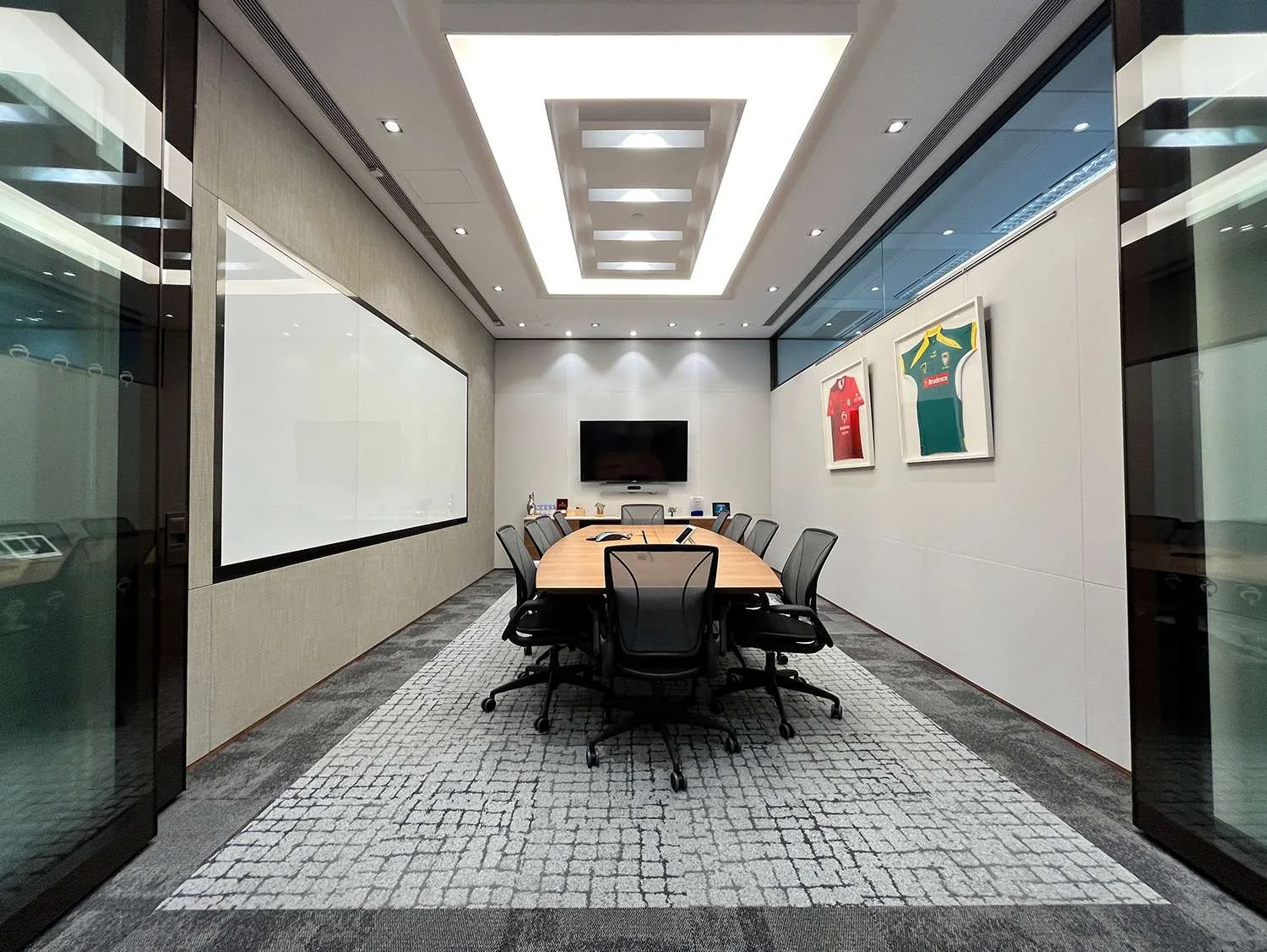
Lighting can clarify an office. Stronger, welcoming light may suit arrival and collaboration; controlled, comfortable task lighting can support focused work; a meeting room needs light that works for people on screen as well as people in the room. Coordinate lighting with ceilings, furniture and technology rather than selecting fittings in isolation.
Colour works best when it supports the plan. A restrained base palette can make navigation easier, while one or two accent materials can identify a client suite, team neighbourhood or social space. Avoid treating colour as a substitute for clear wayfinding, sound planning or a comfortable layout.
Consider daylight and glare at the same time. The desired view may need shading or a different screen position. Test important work settings in the real floorplate before committing to a visual reference that has not met the building.
Further reading: CIBSE, Lighting Guide 7: Office Lighting
05
Bring nature in through performance, not props
Biophilic design can mean more than adding plants beside a workstation. It can include access to daylight, views, natural materials where appropriate, varied settings and a more comfortable sensory environment. The most valuable choices are those that fit the workplace and can be maintained well.
Before specifying planting or timber finishes, consider irrigation, cleaning, replacement, fire requirements, light levels and the building’s maintenance capability. A poorly maintained feature can undermine the very sense of care it was meant to create.
The International WELL Building Institute provides research and frameworks around environments that support health and wellbeing. For an office project, that is a prompt to make specific, supportable decisions about comfort and experience rather than making generic wellness claims.
Further reading: International WELL Building Institute, WELL at Scale
06
Make technology feel part of the room
Meeting technology is most successful when it is planned with the room. Screens, cameras, microphones, speakers, controls, power, furniture, lighting and acoustics all influence whether a hybrid conversation feels natural. A sleek room that produces poor sound or awkward camera angles does not support the intended experience.
Plan cable routes, equipment locations and maintenance access while the layout is being developed. This avoids a late collection of visible devices and ad-hoc power solutions. The same approach applies to access control, digital signage and workplace booking systems.
Ask users to test a representative room before the standard is repeated. A short pilot can reveal whether the table, screen position, lighting and controls work for the ways the team actually meets.
07
Choose details that can age well
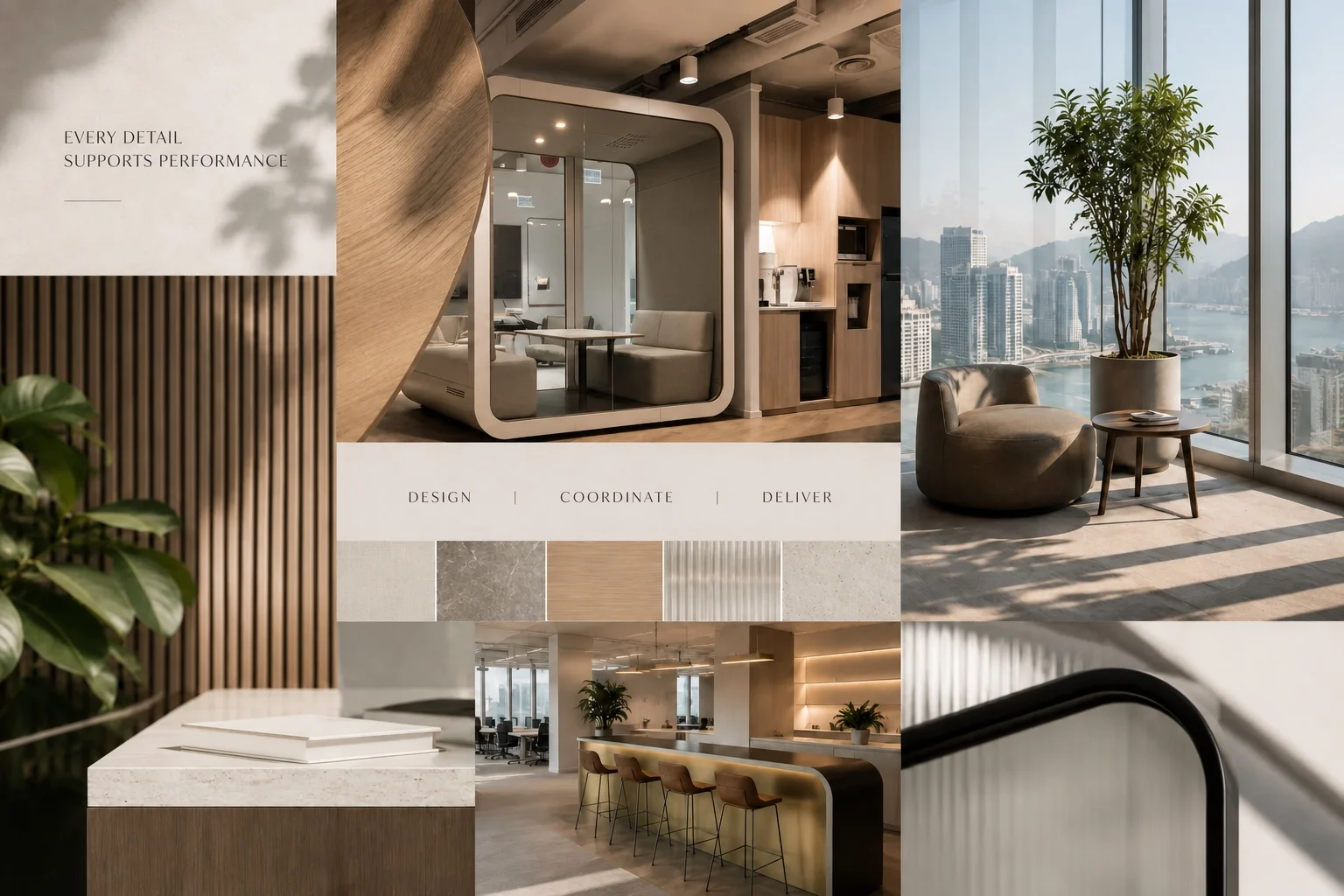
A premium workplace does not need fragile finishes. Specify materials with a known maintenance route, repair strategy and replacement availability. Consider where hands touch, where bags scrape, how a cleaner accesses a surface and which details will be seen at close range every day.
Sample reviews are useful because colour, texture and reflectance change under real light. Agree what constitutes an acceptable installation, especially for joinery, stone, metal, paint, glazing and feature lighting. A single approved sample can prevent a finish from drifting across a large floor.
The best design ideas become part of an office’s long-term identity when they are built with restraint, clear detail and a realistic understanding of use.
| Detail | Practical check |
|---|---|
| Feature joinery | Access, edge protection and repair route |
| Upholstery | Cleaning, wear and replacement availability |
| Planting | Light, maintenance and irrigation responsibility |
| Lighting | Glare, controls and maintenance access |
| Meeting technology | User testing, cabling and support |
08
Edit the idea until it is buildable
A strong office idea survives cost planning and coordination because it has a purpose. When the programme or budget requires a choice, protect the elements that carry the workplace experience and simplify elements that do not. This is not a loss of design intent; it is what makes the final result coherent.
MJPM designs and delivers workplaces with the practical decisions in view: how the business receives clients, how teams meet, how services are coordinated and how details will perform after handover. Project references can be useful evidence when they show the story behind a completed space, not only the photograph.
Use inspiration to start a useful conversation, then convert it into a brief, a plan and a delivery route. That is how a design idea becomes a workplace people want to use.

Practical
How to turn inspiration into an office brief
Collect fewer references and describe them better. For each image, record the part that matters: a visitor’s clear route, an acoustic retreat, a material that feels calm under natural light or a meeting setting that makes remote participants visible. This separates useful evidence from a visual mood board that cannot guide a project decision.
Next, identify the non-negotiables. The office may need to retain a harbour view from a client room, create an adaptable project space or express a new brand direction without disrupting a fixed move date. These priorities help the project team decide what to protect when cost, access or lead times require a choice.
Finally, ask the delivery team to show how the strongest ideas will be sampled, coordinated and maintained. An idea earns its place in the design when it remains clear in a drawing, a quotation, an installation and the daily operation of the workplace.
One final test is whether the proposed idea makes the workplace easier to understand. A visitor should know where to go, a new employee should recognise where to work and a team should be able to choose the right setting without a handbook. Design that supports these ordinary moments has more lasting value than a feature that only succeeds in a photograph.
| Reference | Translate into |
|---|---|
| Lighting mood | Required light quality, controls and glare check |
| Feature material | Sample, durability and maintenance route |
| Flexible social space | Furniture, storage and acoustic requirements |
| Branded arrival | Visitor route, signage and security brief |
| Hybrid meeting room | AV, furniture, lighting and acoustic standard |